Explore our NEW Knowledge Base and Help Desk to find everything you need to attract, engage and convert talent with your Vennture website.
Discover More
Over the past couple of years, the balance between desktop and mobile searches has tipped heavily in the favour of mobile searches, as it’s reported that more than 70% of internet traffic now comes from mobile phones. As device usage only continues to increase, the split is expected to favour mobile even more.
How has Google evolved its mobile results?
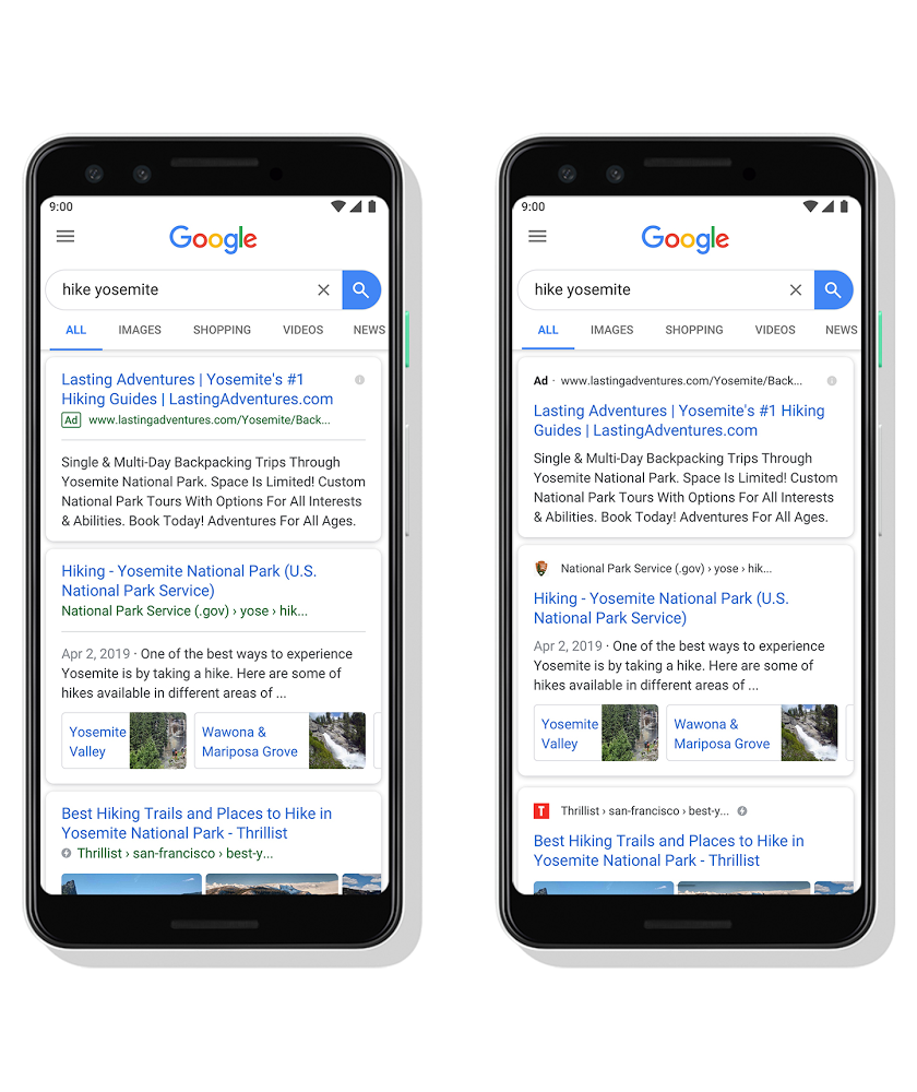
Recently, Google introduced some new design changes to the organic search results on mobile. This can be seen in the before and after image below.

As the lines between PPC and Organic Search results are becoming increasingly alike, there is a need to differentiate your website from that of the paid ads and competitors who are all vying for the same space.
Among the recent changes, Google has now added Favicons to the organic search results. If you are unsure what a favicon is, it’s a small image which normally consists of the brand logo, for example;
![]()
You’ll notice, the site name and breadcrumbs appear in black text next to the favicon and both display above the title link in a similar structure to the new text ad. Prior to this update, the site name and breadcrumbs appeared in green text below the title.
Google has also removed the grey line below the organic titles and ad headlines, so each card looks more like a single unit.
What is evidently clear is that Google is now making it increasingly difficult to distinguish between a paid ad and an organic search result. Previously, the paid ad within the organic search result appeared within a green box underneath the ad headline.
By now, you should have already optimised your site for organic search, especially with the recent changes to the SERPs. Direct and search competitors are constantly optimising their site, by finding new organic opportunities and building on their organic rankings as a result.
In terms of this latest update to Google’s Search Results page, the best tips for generating a Favicon for your site is:
Distinguishing between paid ads and organic search results is becoming increasingly difficult, purely because they now look so similar.
Despite the results for both channels becoming increasingly alike, there is still a need to strategise a paid and organic search strategy as both channels complement each other.
The paid ad channel will get you instantaneous results but comes at a cost. Meanwhile, optimising a site for organic search will provide long-term results, without the cost.