Explore our NEW Knowledge Base and Help Desk to find everything you need to attract, engage and convert talent with your Vennture website.
Discover MoreHow to Get UX Design Right Every Time: 5 Top Tips
20 Jul, 20213 minutes
Designing a good website is about more than just creating a visually pleasing experience for your user. Of course, a website that looks good is more likely to engage your audience, but if your user journey is confusing and disjointed, you'll likely see higher bounce rates, shorter sessions and a lack of conversions. So how can you make sure your website not only looks good but provides a fantastic customer experience?
Put your users first.
As Mike Kuniaysky, UX designer, researcher, and author puts it, user research is:
“The process of understanding the impact of design on an audience.”
This element of web design is often overlooked, coming second to visual design. When designing a website, your user personas should be at the forefront of your UX design process - have you considered who your target audience is and invested time into creating user personas? User personas provide a clear, semi-fictional character to reference as a reflection of your ideal customer(s).
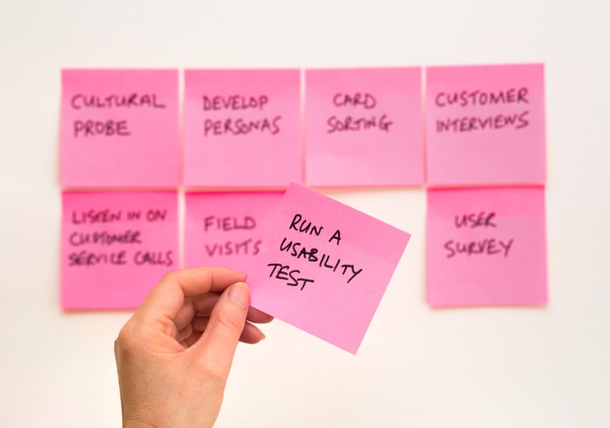
Establishing a user's pain points when interacting with a website is fundamental to ensuring your customers can navigate your site to achieve their goals as quickly as possible. By conducting user-led research, you can identify trends in how a user navigates around a website, produce heatmaps of the most common click-points and much more. Whether you conduct surveys for on-site user experience or use data from a series of demo tasks to establish how users interact with your website, this user research should be used to inform design decisions.
Usability testing will help identify user behaviours and allow you to view your website from the perspective of your customers. For example, could they complete a set task? How long did it take? Where did the user click most? How far down the page did they scroll? These are all questions you should be asking to determine whether or not your UX design is up to scratch.
What does the user expect?
Reinventing the wheel each time is not always necessary. Thankfully with website design, there are several pre-made conventions that users will find familiar and expect when interacting with a site. This isn't to say that user flow should be forgotten. Rather, this should be used to every web designer's advantage.
No user wants to be greeted with large blocks of text, no imagery and poor navigation. Instead, the website should tell the user what to do and make their goal easy to carry out. For example, most customers can identify a search bar and expect to see this at the top of the site. Equally, your logo and menu or navigation tabs should be positioned above the fold and partnered with a CTA and business contact details.
"By conducting research and making design choices based on what you've found, you can design the site right the first time, saving money in the long run." - Ross Miller, Digital Designer at Venn
Top 5 Tips
1) Natural Grouping
There is a strong correlation between design and psychology. The cognitive shortcuts our brain subconsciously takes can influence user experience design choices to direct a customer's attention to take out specific actions on a site.
Great designers will understand how our brains interpret visual information and organise similar items and design elements on a page to make sense and be recognisable. For example, similar colours, shapes and compositions can aid a user to instinctively establish whether elements on a page are related to each other, all contributing to a seamless user experience.
2) Less is more
Keep it simple stupid. KISS focuses on the idea of keeping the design simple enough that the majority of your audience will be able to understand and use your website. Simplifying and streamlining a website's design leaves little room for a user to get distracted when trying to fulfil an action on-site. In turn, this can maximise conversions through a smooth user experience.
3) Keep the flow
Each click on your website should direct the user one step closer to achieving their on-site goal. The '3-click rule' is no longer considered an unbreakable UX design rule. However, the principle behind making the user's journey as straightforward as possible is still very much an essential part of the website design phase.
A fluent user journey will encourage customers to stay on-site longer and reduce the likelihood of a user leaving the site due to frustration and the inability to complete their desired task.
4) Check out your competitors.
Being aware of what your competitors are doing is key to ensuring that you can compete with them. Spend some time navigating their website to pinpoint what works well and what doesn't. Can you identify any pain points that may be relevant to your website? If so, learn from this and make sure you do it better.
By putting yourself in the shoes of your users, you can better understand how your customers respond to specific design choices. Then, use this experience to inform decisions you make about your website to provide a great user experience to all customers who visit your site.
5) Review your website regularly.
Once your site is live, the work doesn't stop there. Technology is continuously changing. Ensuring your website's functionality is suited to what your users need is essential to the success of your site. Adapting your website in response to customer needs will help satisfy your users by guaranteeing their user experience is as smooth as possible.
Users will always remember a bad website experience, and this may send potential customers straight to a competitor's website. If you're looking for an agency that knows what it takes to make an intuitive website where the user's experience is the priority, speak to a member of our team today.


